Hola quiz-amigos. I am back after a long hiatus, during which time The Incredible Devadutta has posted some utterly brilliant questions and managed this place completely solo. Many thanks Mr D!
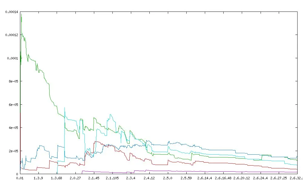
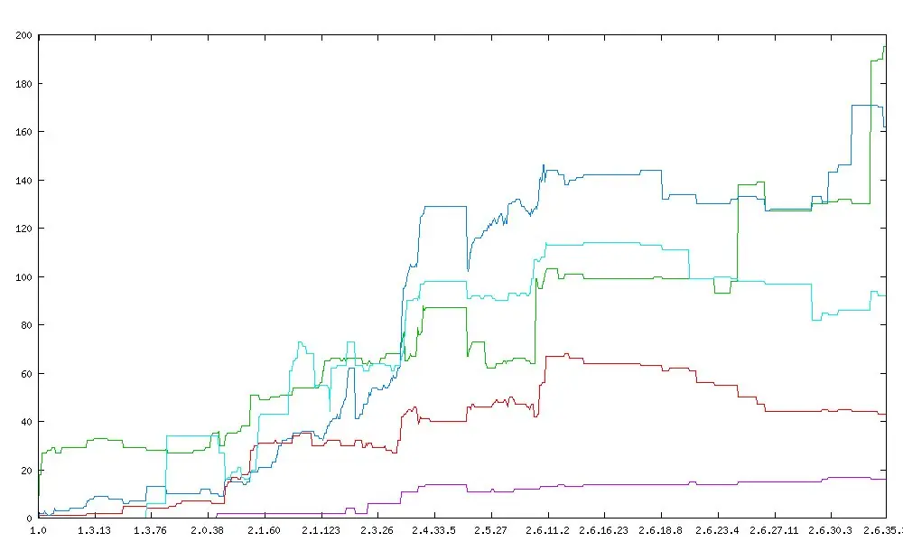
Here’s welcoming the new year with a back-to-basics Geekiness question. See the graphs below. What are they depicting?
PS: Refrain from going into gory details, plzkthx!
Cracked by: udupendra, Kaustubh, Bharath, dineshk, Rogi, jowens, Manish Achuth, duriel, Shwetha Maiya, shrik, Tushar S, Dibyo, raklodramA, Raghuvansh, Pawankumar Hegde, SV, Logik, Sumanth Patlolla, Rahul Rajeev, apar, lanu, Thejas V R, Ananth, Bipin Banavalikar, Siddarth Pai and Rahulk
Show Answer
The Linux Kernel Swear Count graphs - depicting the frequency of swearing in source files in the linux kernel. As you can see, the kernel is definitely maturing over time! http://www.vidarholen.net/contents/wordcount/